After the talk, the question I kept getting had almost nothing to do with the talk. People asked how I made the slides. Then how I made my website. What skills, what stack, what did I use. I stood there and mostly said, uh, I don't know, a lot of it is my vision for things.
Here is the better answer, the one I have been giving since. If there is something you want to build, go find somebody who has built something close to it, take their repo, and tweak it, instead of building it from scratch.
That is the whole method. I think it sounds too small to be a method. What takes the time is everything between "tweak it" and "this is live."
What I showed Fable.
On August 30 I opened a thread and said this. I want a mockup of a website. The industry is AI architecture, design and innovation. It is a portfolio site. It also has articles posted regularly, a podcast, and a plain breakdown of what I do that converts. I want it to be the quality of these, and I pasted the Fable showcase.
I had texted that link to myself a few days before, the way I text myself everything I want to come back to.
This is the message that started the build, plus the three notes I sent back over the next two hours as things came in wrong. Swap my industry for yours and I think the shape still works.
I'd like to make a mockup of a website. The industry is AI
Architecture, design and innovation. Its essentially a portfolio
website but also has articles that are posted regularly, a podcast,
and an innovative but cohesive breakdown of what I do that is clear
to the potential client and converts. I would like the website to be
of the quality of these here: [showcase link]

What else do you need to make this happen?

---

I want lots of animation and creativity and I want to design with
the users nervous system in mind.

I really want the titles of things to just say what they are.
ie. Portfolio, articles, podcast, systems.

I'd like the option to have a light and dark mode, maybe even a mode
that changes due to the time of day for the user.
The interview.
The first pass came back finished and pretty, and I said no. It was nowhere near the showcase sites and I did not like the colors. Instead of giving art direction I don't have words for, I said: feel free to ask me questions and interview me until you're sure.
So it asked. Not about fonts. About my body. What should a visitor's body do in the first five seconds on the page? I picked quiet awe, lean in. What color world feels right? Golden-hour earth and living botanical, the world my photos already live in. How much motion? One continuous scene. And which hero should the site open on? That one I couldn't answer from a list of descriptions. I wrote back: I'd need to see them.
If you can't feel a design from its description, ask to see them all. I think that's the whole trick.
Yours to reuse on your own build.
What should a visitor's body do in the first five seconds
on the page?
What color world feels right?
Which living hero moment pulls you, and would you know
without seeing it?
How much motion across the whole page?What I asked for.
Short, and mostly made of nos. No stock photos. No AI-generated imagery. What I wanted was for it to feel drawn. Made by a person with a pen.
Two more things I said out loud, because they were the parts I cared about. I want a lot of animation and creativity, and I want to design with the user's nervous system in mind. And I want the titles of things to say what they are: portfolio, articles, podcast, systems.
Then the one that turned into the whole site. I asked for a light mode and a dark mode, and then for a mode that changes with the time of day for whoever is visiting.
The four auditions.
Instead of choosing for me, it built an audition page. Four full-screen heroes, all in my color world, each one alive under the cursor. This is a small version of them, running. Kind of the whole article in one box.
Breathing light. Dappled sun drifting at breath pace, about five and a half seconds per cycle. I couldn't see anything moving, and I said so.
Something growing. A tree of sage and umber grows itself in, sways in a wind your cursor controls, then fades and starts over.
Dust to form. Warm particles drift until they pull into a shape: a seed head, an archway, a dome.
You are the engine. A dark golden-hour room where nothing gathers until you move. The faster your hand, the more the dust charges into form.
Dappled sun drifting at breath pace.
What each one meant.
I liked three of them and refused to pick one. I asked what each meant for my business instead, and the answer mapped them straight onto the work. Dust is how my clients arrive: brilliant, scattered, starting over every morning. The engine is my philosophy of AI, a system that answers your movement instead of acting on you. Growth is what a build becomes with stewardship. And the light I couldn't see moving became the ending of the page, where slow is the point, so the ask lands on a settled nervous system.
Put in order, they read as chapters of one story. The page opens in dust, gathers as you scroll, grows, and settles.
What I rejected.
I killed the dots first. They sat over the hero copy and you could not read it. Then the photo that got dropped into the layout. It looked rough. Then my podcast intro, pasted in as my About section. It read like a transcript.
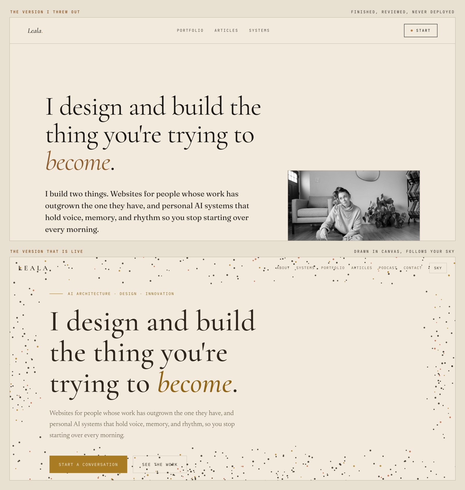
Then the finished homepage. Nothing was wrong with it. I put it next to what I wanted, which was a page that changes with the time of day. What I had built was a page that sat perfectly still. My work is about nervous systems and rhythm. We rebuilt it in a day.
One more thing I learned, about Fable specifically. Its first pass is the best design it will give you. Once you start making edits it plops things in, and the quality falls off from where you started.
The bookshelf.
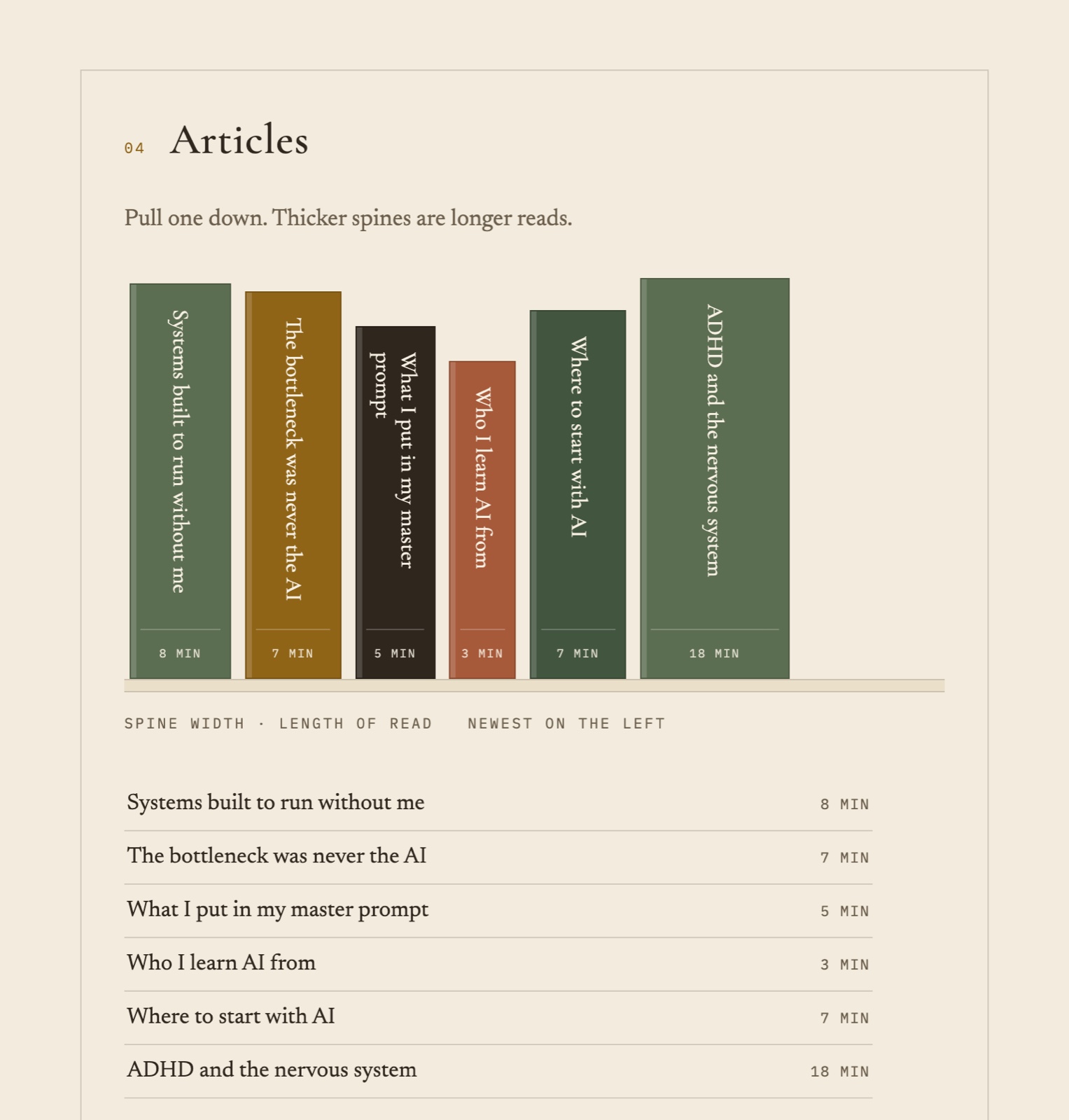
I already had a small version of this and I liked it. The reel gave me a better one. Instead of a list of links, my articles stand up as book spines. The width of each spine is the length of the read. The eighteen-minute piece is a fat spine at 112 pixels. The three-minute one is 50. The legend under the shelf says so in words: spine width, length of read.
I asked for them to arrive one book at a time, and they do. Each spine drops in on its own delay when the shelf comes into view, about a second from the first to the last.
The theme changes with the time of day.
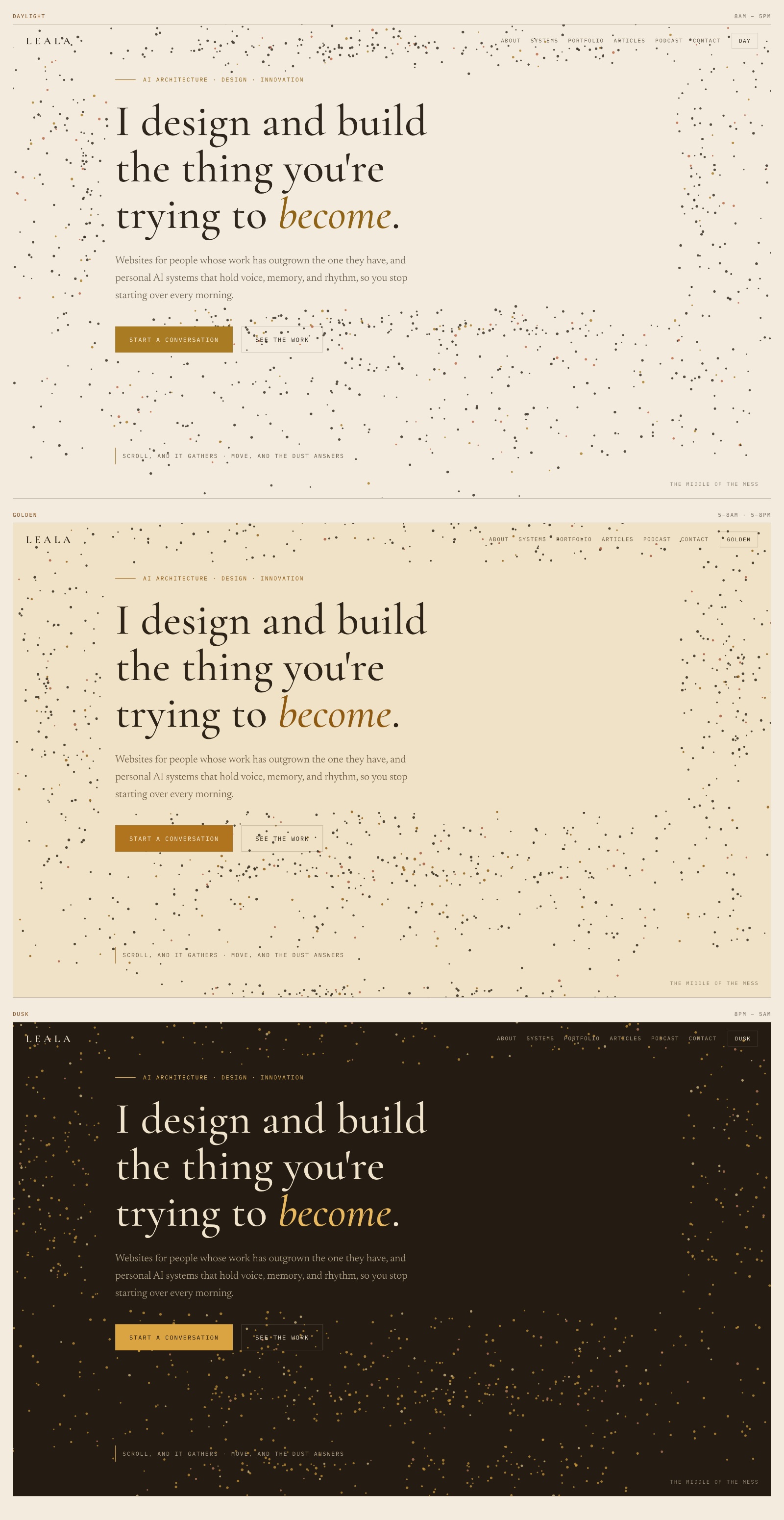
Daylight between eight in the morning and five at night. Gold at the two edges of the day, five to eight in the morning and five to eight in the evening. Dusk the rest of the time. There is a button in the corner. Press it to hold one mode and stop the page following your clock.
How the animation connects.
I told them early that I want graphics to resonate with me and to serve a purpose, not just look cool. That is the test I kept applying. It cut the dust back and pulled it clear of the hero copy.
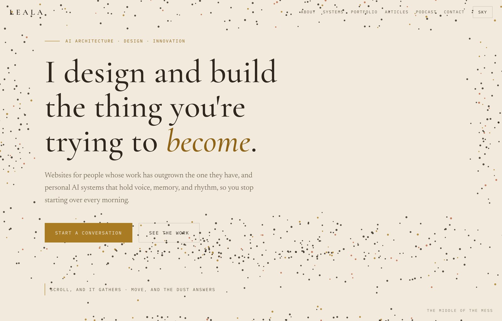
On the page now, the dust follows your cursor. Scroll and it gathers. About a third of the way down it grows into a tree, then releases and settles again. The line in the corner of the hero says what it does: scroll, and it gathers; move, and the dust answers.
The page responds to you and then goes quiet. That is what I do for a living. It is the right animation for me, and I feel like it would be the wrong one for somebody else. Take the bookshelf or the dust and put them on your site and they will look like a costume.
There are no images on the homepage at all. It is one file, 128 kilobytes, and every part of it is drawn in the browser.
What I would change next.
The shelf and the plain list under it are two separate lists in the code right now. In six months the pretty one will be current and the plain one will be a lie. They need to come from one place. My portfolio is out of date and I want everything I have built this year in it.
I already have ideas to improve this, and it is going to change. Follow along if you want to see how it evolves, and let me know if you want me to help with yours.